Creating a basic Visual/Graphical Resume
 Resumes have emerged as an important tool for job-hunting in the recent times. They serve as an important medium to convey and know an individual’s career history, skills, and competencies, while helping a hiring manager ascertain whether a candidate would be good for the role advertised or not. A well-developed résumé greatly tips the odds in the favor of the candidates who win points not just for a well-represented career journey, but also for information flow, coherency, readability, and representation.
With the advent of technology, and its usage in our daily lives, it doesn’t come as a surprise that résumés too are gearing up and taking it a notch higher. With the increasingly fast-paced life and less time at hand, “less is more” is the new mantra. Combine this with the advent of digitization, visual elements are becoming increasingly attractive and the choice of communication when one wants to convey a point quickly and succinctly. It is no wonder, therefore, that résumés be untouched with this growing trend.
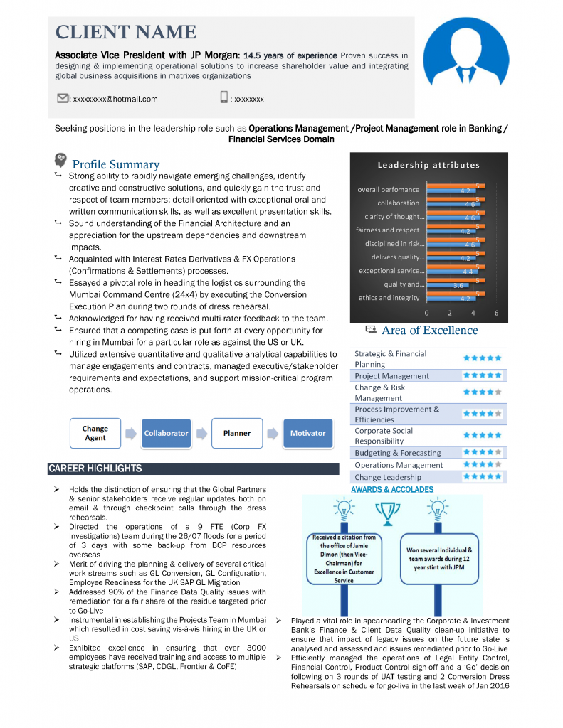
Welcome the Visual/Graphical Résumé, a document that combines visuals elements to put together and communicate your career journey to potential recruiters in an interesting, yet time-affordable way. A visual/graphical résumé banks on the fact that people, or rather recruiters, are flooded with a plethora of options these days, and have very less time to read through and scrutinize individual profiles carefully, and uses this to its advantage to communicate “more in less”.
While there are many ways to create a visual résumé, ironically it takes a lot of time and patience to draft one. And, as mentioned earlier on, people don’t have much time these days. So, what to do when you have less time but want your résumé to be up-to-date with the latest standards and not miss out on some awesome opportunities? This article tells you how to create a basic visual/graphical résumé, that balances text and visual elements to create a great document in no time.
First things first. You should segregate your résumé into two sections: one with data you can represent pictorially/visually, and the other that can be written as text. While this might be a little tricky, you can make use of this as a checklist for things you can almost always represent visually on your résumé: Skills, Career Journey, and Achievements. Note that visual representation spans a lot of things: pictures, graphs, shapes, SmartArt, etc. For most of the résumés, the rest of the information, such as the Profile Summary, Professional Experience, Education, Projects, etc. are mostly represented in text form.
Now that you have segregated the visual and non-visual sections of the résumé, you need to start working on your draft. I’d ideally suggest a one-page visual résumé, since a one-pager is easy and quick to read (also quick to draft), but a two-pager would also work for more experienced professionals. Since this would be a visual résumé, I’d also advise to take on the LinkedIn approach: write quality content as opposed to quantitative content, since you are aiming to create a draft that needs to be relevant and quick on the reading aspect.
Coming back on how to draft a visual/graphical résumé, once you have segregated the visual sections, you need to analyze how to represent the sections. The three broad sub-sections that we chose earlier, can be represented in different ways, but I’d suggest the easy-to-make options.
1. Career Journey: The easiest way is to represent your career journey through a timeline. It doesn’t need to be anything fancy, a simple line representation showing the duration and your employment episodes would suffice. You can also make a creative and fancy timeline if you have the time for it.
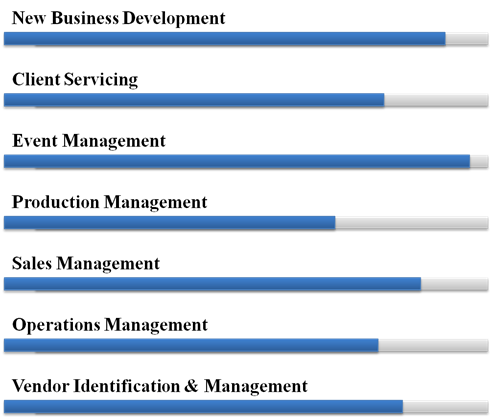
 2. Skills: The best way to represent skills in a visual/graphical résumé is to quantify your expertise for an individual skill. Remember, this looks nice only if you pick out at least seven to eight key skills, and rate yourself on the same on a scale of either one to five, or one to 10. These can be represented in the form of stars, circles, graphs, or any other shape.
3. Achievements: These can be best represented through pie charts or graphs, more so as a comparison, since these are the quantifiable elements in the résumé. Tip: Represent only the most significant and key achievements from your career, to strike a balance between text and visuals.
4. Others: If you have worked with top MNCs or Fortune 500 companies, then I’d suggest using company logo images to add to the résumé, to show that you possess the necessary skills and expertise, as well as adaptability and flexibility to quickly mingle in a new environment or situations.
While drafting a visual/graphical résumé, I would like to remind you once again to pay emphasis on the “less is more” philosophy, and write as less content as possible in the draft, giving away only crucial information and not everything under the sun. Combined with the above points, you will be able to prepare a basic visual/graphical résumé for yourself, saving significant time and staying up to date on the job and market trends.
Happy job hunting!
Author:
Amrita Kolay


